ANNA SCHWARTZ PROJECTS
ANNA SCHWARTZ GALLERY TO CLOSE AND REOPEN AS NEW ENTITY: ANNA SCHWARTZ PROJECTSAfter four […]
Read MoreIn 1990 Stieg Persson produced an ambitious 16-part rumination on mortality. Ethereal and eerie, the series took its name from the ”stations of sickness” of John Donne’s 1624 work Devotions Upon Emergent Occasions.
“I wanted a great epic,” says Persson, amid his 35-year survey exhibition Polyphonic at The Potter gallery. “I wanted to see if I could do that thing Renaissance painters do, take something like the life of St Ambrose or the 12 stations [of the cross]. I used Donne as the structure, which is about illness and questioning of faith.”
Stieg Perrson, History Painting (2006).
Photo: C.CapurroThroughout the ’80s Persson displayed a predilection for blackness and dark subjects. But this was more than just youthful angst in postpunk Melbourne. Persson, 31 at the time, completed the work as part of a four-month residency at the oncology unit of Heidelberg Repatriation hospital. Additionally they represent a poetic attempt to record the era’s great sickness.
“This was early AIDS and it was a death sentence,” he recalls. “People were dropping like flies and no one knew why. It was a particularly eerie time. [The series is] kind of plague paintings.”
One work, Painting 1990, The king sends his own physician, captures the mood. It incorporates text from a 17th-century bill of mortality (the weekly tally of people who had died from the plague), making the connection to black death literal.
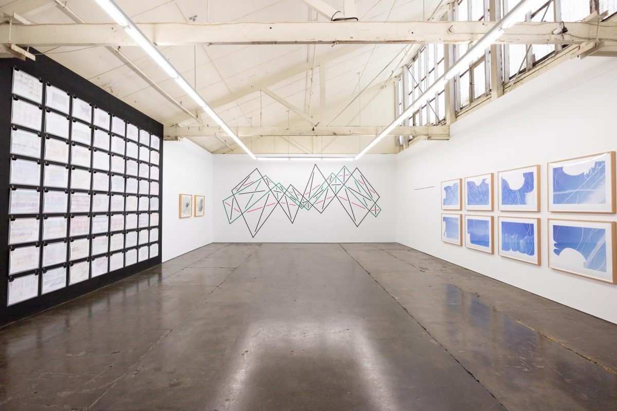
Death fills the Potter gallery’s ground floor. Plumes of white vapour erupt from Stygian black canvases. X‑rayed bones and vanitas skulls hover in the ether. It would be overwhelmingly grim if not for the decorative arabesques that transmute the work from meditations on despair to a suggestion of inner peace through sensual beauty. Among Persson’s most celebrated works, the ”plague paintings” concluded a dream run.
“During the early 1980s Persson was on a stellar trajectory,” says curator Kelly Gellatly. “At the age of 24 the Metropolitan Museum of Art acquired one of his works. He showed in high-profile international and Australian contemporary exhibitions, such as Australian Perspecta in 1985 and The Australian Bicentennial Perspecta of 1988.”
Then, after finding beauty – and considerable success – in death, Persson killed it off.
Stieg Persson’s The Fall (2004).
Photo: C.Capurro“I got sick of black paintings,” he says. “I thought ‘this is really successful and I could probably go on and make a really good living out of this,’ but it would just bore me senseless.”
He even toyed with the idea of giving away painting altogether.
Stieg Persson’s Painting 1993 Spring thaw, 1993, in pencil, oil and acrylic on cotton duck. Courtesy of the artist and Anna Schwartz Gallery.
Photo: C.Capurro“I became cynical with the whole scene,” he says. “I needed to break the spell. I needed to try things that I knew would be difficult for an audience. That was the only way to progress the work. So I decided to try and stuff it up.”
Persson created the vilest paintings he could. The bilious series of green and white experiments in collage and pattern included a sculpture of Manet’s syphilitic leg as its centrepiece. “I was trying to make horrible things and make it work – how do you balance and control it?”
As expected, the reaction was “What the hell is this guy doing?,” he recalls.
Death and illness might well be difficult subjects, but questioning good taste and privilege preoccupies Persson. How we die is one thing, but how we live might be the more bitter pill.
“The exercising of taste is one of the most potentially shameful and exposing things the middle class can do,” Persson told Art Collector magazine in 2014. “As it happens, this anxiety is at the very core of art and art collecting.”
One of the discoveries in this mid-career survey is how early these itches are scratched. Covetousness (1983) features the Biblical commandment’s lesser-known object of desire, thy neighbour’s donkey. Circling the doleful, arcane ass are silhouettes of contemporary material obsessions: boat, car, jet, camera, alcohol. The sins of consumption and ”good taste” are literally the subject of his 2015 series, How We Live Now, in which Persson skewers the cult of foodism. The panels could be wall sections from a designer café. Here Persson’s silhouettes are abstract ”heraldic” black chalkboards advertising menus and specials. Each title gains its name from the ingredients that float around the canvas. Instead of an obscure Biblical reference, Persson layers Poussins and Grapes (2015) with an art-historical in-joke.
“Within the history of painting there are is an old Renaissance quarrel that disegno – drawing – is most important while others thought colour was more important. Drawing [advocates] were ‘Poussinists’. One of the first books on painting talked about Titian’s grapes. Instead of drawing each grape, he ‘paints the bunch’. It’s a philosophical difference, but it’s a ‘painty’ one. It’s ridiculously obscurantist, but it keeps me amused.”
In this archaic debate Persson’s precisely handled imagery places him closer to the drawing camp. But his approach to pictorial space follows the liberation of art after 1945.
“I’ve always liked that idea of the picture as a field on which something happens, rather than a depiction of something,” he says. “The figurative elements become punctuation points within that.”
Still lifes, vanitas symbols, Malevich black squares and bizarre quotidian items like email spam may feature in Persson’s fields that range from relatively minimalist to highly layered canvases. That diversity of subjects explains the Polyphonic title of the survey. What unites the works is a keen sense of decoration, an idea often at odds with avant-garde sensibilities.
“The decorative is a statement of honesty,” Persson argues. “What does a painting actually functionally do? Decorate a room. We never discussed this [in art school]. Why were we hiding this? It’s an essential part of the function of what a painting is.”
Where filigrees and arabesques feature in Persson’s early paintings, later works update them with a street flourish, tagging. Against the icing-white backgrounds of the How We Live Now series, Persson incorporates graffiti tags lifted directly from his toney neighbourhood. Painting the tags gold aligns the work with the accoutrements of Rococo richness, according to Persson. “It’s neo-liberal selfishness done by kids in Brighton,” he says derisively.
“There’s always been a theme [in my work] to do with privilege,” says Persson. “One of the things I find extraordinary is although there’s a reverence for the ascetic, we live in a hedonistic sphere. We’re all guilty of it. F – k I live in Brighton! Particularly with the latter work the visual exuberance of it is meant to reflect that hedonic world.”
The decadent spoils are evident in the abject good taste of Frenched (2007), where the greedy smears of greasy lamb-chop bones are used to paint the canvas.
Understanding Persson’s antagonism to privilege (and its abuses) helps explain the oddest work in his career, the Gothenberg Crosses (1996−7). Conceived during his first trip to his ancestral Sweden in the 1990s the series was inspired by Scandinavian Death Metal bands.
“I don’t want to be preachy or moralise,” says Persson, recalling the shock. “But at the same time this was bizarre. Here’s the children of the social democratic utopia, the wealthiest population on earth, who’ve been educated, had their health looked after – and they turned virulent.”
Indeed, not only did the bands espouse hatred and extreme neo-nationalist views, the subject of one painting Untitled (1996−97), Varg Vikernes, was convicted of murder and accused of burning churches.
Society’s ugly undercurrents are not all subcultural. Closer to home a state-sanctioned killing incurred Persson’s ire in what he considers one of his most important pictures, History Painting (2006).
A small screwed-up newspaper floats over a field of colour and two crossbones over the canvas centre. Close inspection reveals a name, Nguyen. It’s a death notice.
“[Caleb Nguyen] was the [Melbourne] kid who was executed in Singapore [in 2005] for carrying drugs to bail his brother out of trouble,” Persson explains. “I thought, ‘no one will remember that kid’. But I did. It still upsets me now.”
Given the genuine emotion the incident elicits in Persson, why is the work so subtle? Why not trumpet the anger in a tabloid painting?
“That has always been within the sensibility of the work,” he says of his ”velvet glove” approach. “It’s never ‘shouty’ because I want the aesthetics of the work to take autonomy. I’d rather people just look and get some enjoyment before they start. Hopefully if I’m doing my job, they’ll piece together the elements within.”
As Gellatly observes, Persson’s “beautifully packaged observations are … at once accusatory and strangely seductive”.
Stieg Persson: Polyphonic The Ian Potter Museum of Art, University of Melbourne Until July 1; art-museum.unimelb.edu.au
Photo: Eddie Jim
ANNA SCHWARTZ GALLERY TO CLOSE AND REOPEN AS NEW ENTITY: ANNA SCHWARTZ PROJECTSAfter four […]
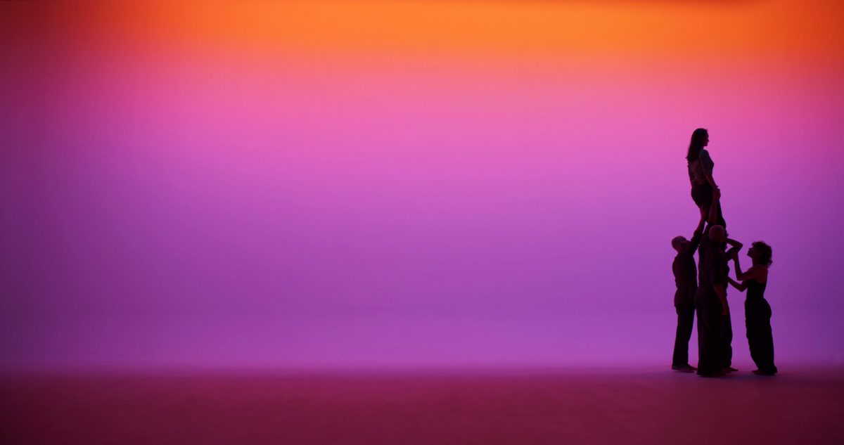
Read MoreOne of Australia’s most acclaimed contemporary artists, Angelica Mesiti, will première an immersive visual […]
Read More‘Breathing Helps’9 August — 9 November 2025TarraWarra Museum of ArtVictoria TarraWarra Museum of Art presents […]
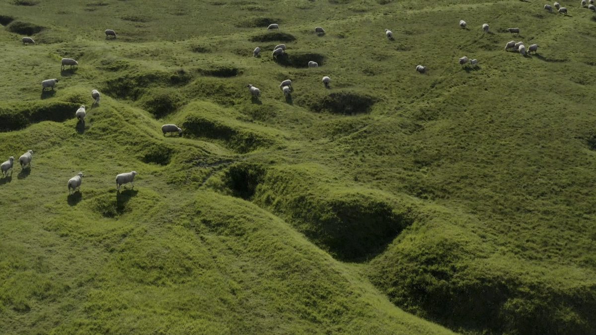
Read MoreThe Unsettled Soul 28 October 2024 – 28 April 2025Kunsthalle PrahaCzechia Around 400 kilometres of […]
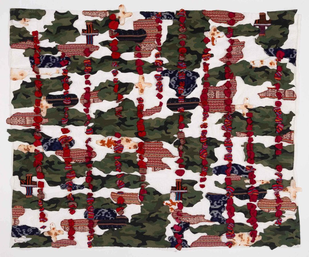
Read MoreRadical Textiles 23 November 2024 – 30 March 2025Art Gallery of South AustraliaKaurna / South Australia […]
Read MoreSocial Studies 9 November 2024 – 9 February 2025Geelong GalleryKulin Nation / Geelong Artists have long […]
Read MoreIna Lou / Dear Mother Earth: Sea, Soil and Solidarity 19 – 20 November […]
Read MoreProsodic Grains 2 November 2024 – 30 March 2025By Art MattersHangzhou, China The exhibition features […]
Read MoreThe Burden of Objects 9 – 13 October 2024 Melbourne Sculpture BiennaleNaarm / Melbourne The Burden […]
Read MoreTais, Culture & Resilience – woven stories from Timor Leste September 19th – December 10th, 2024Trinity […]
Read MoreArtsHub Exhibition Review: Infinite: Dobell Australian Drawing Biennial 2024, AGNSW14 September 2024 – 1 […]
Read MorePANSORI: A Soundscape of the 21st Century 7 September – 1 December, 2024Gwangju, South Korea Conflictual borders, anti-migration […]
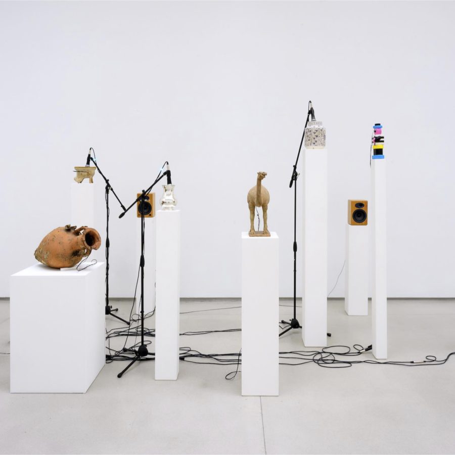
Read MoreMILKSTARSSound Constellations In The Chartwell Collection17 August – 20 October 2024Te Uru Waitākere Contemporary […]
Read MoreMILKSTARSSound Constellations In The Chartwell Collection17 August – 20 October 2024Te Uru Waitākere Contemporary […]
Read MoreThe Rites of When September 21st 2024 – May 11th 2025Art Gallery of New South […]
Read More(SC)OOT(ER)ING aroundSu san Cohn and Eugenia Raskopoulos August 3rd – November 10th, 2024Tarrawarra Museum […]
Read More2024 Ravenswood Australian Women’s Art Prize11th – 26th May, 2024Sydney, Australia The Ravenswood Australian Women’s […]
Read MoreRoma AmorThe Fall of EmpiresBiennale of Bonifacio #2 May 10th to November 2nd, 2024De […]
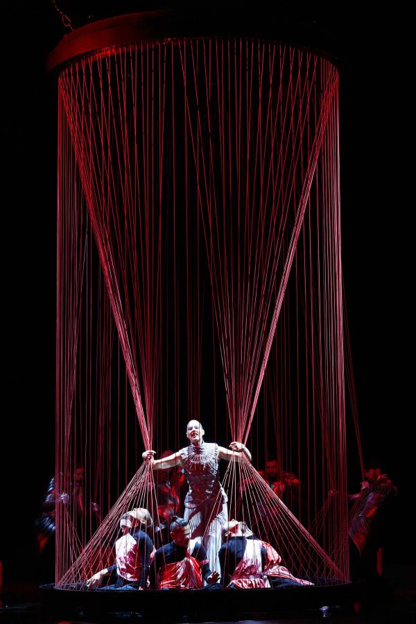
Read MoreIdomeneo, re di CretaDramma per musica by Wolfgang Amadeus Mozart February, 2024Grand Théâtre de GenèveGenève […]
Read MoreHistoryA microcosmic perspective May 4th – December 7th, 202420⁄21 espacio de arteBonifacio, Corsica, France World […]
Read MoreArt in Conflict 20 April to 9 June, 2024 Noosa Regional Gallery Art in Conflict is […]
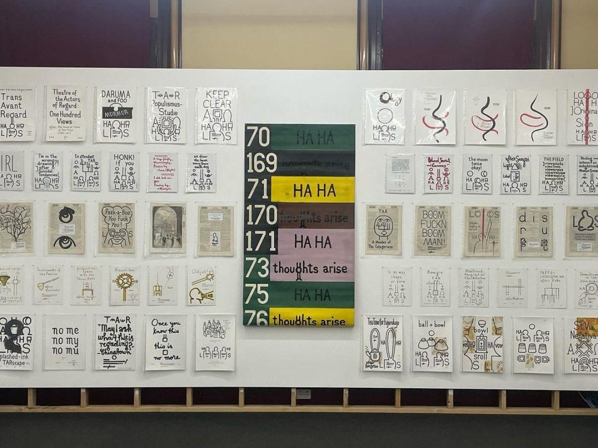
Read Morethoughts arise / HA HA 11 April to 11 May, 2024 Conners Conners Gallery Read […]
Read MoreCharacters 5 April to 4 May, 2024 Haydens Haydens is pleased to present Characters, a group exhibition […]
Read MoreEarrings are for Listening. An Engelhorn Lecture at Die Neue Sammlung3 March 2024, 11amDie […]
Read More