Joseph Kosuth, Laurie Anderson, Janet Burchill & Jennifer McCamley, Tracey Emin, Brook Andrew, Pierre Huyghe, Lori Hersberger
Neon
30th August – 25th October 2008
Anna Schwartz Gallery Carriageworks
-
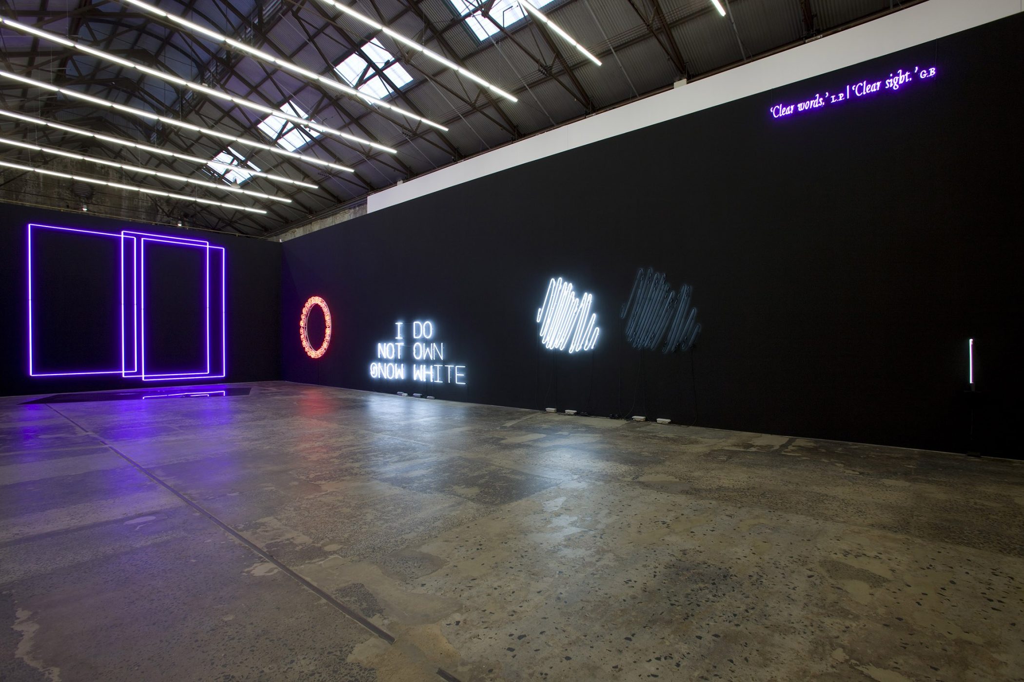
NEON, 2008
installation view, Anna Schwartz Gallery, Carriageworks
Photo: Paul Green
Curated by Tania Doropoulos -

NEON, 2008
installation view, Anna Schwartz Gallery, Carriageworks
Photo: Paul Green
Curated by Tania Doropoulos -

NEON, 2008
installation view, Anna Schwartz Gallery, Carriageworks
Photo: Paul Green
Curated by Tania Doropoulos -

NEON, 2008
installation view, Anna Schwartz Gallery, Carriageworks
Photo: Paul Green
Curated by Tania Doropoulos
Neon is a rare gaseous element present in the earth’s atmosphere at one part in 65,000. Neon is one of the noble gases – noble because under standard conditions, it is a colourless, odourless, monatomic gas, with low chemical reactivity. When used in vacuum discharge tubes and lamps, neon glows red. In Greek, neon is ‘new’.
On the occasion of NEON at Anna Schwartz Gallery, Sydney the works of ten artists have been collected in one space. Paradoxically, given its ubiquity in signs and advertising – consider Las Vegas, Osaka or Hong Kong – neon, here, is the medium for singular works of art.
Each artist brings to NEON a unique approach to art, ideas and material. Somewhat conditioned by the medium’s technicality (the artists outsourcing production to a certain degree) the ‘idea’ is clearly privileged.
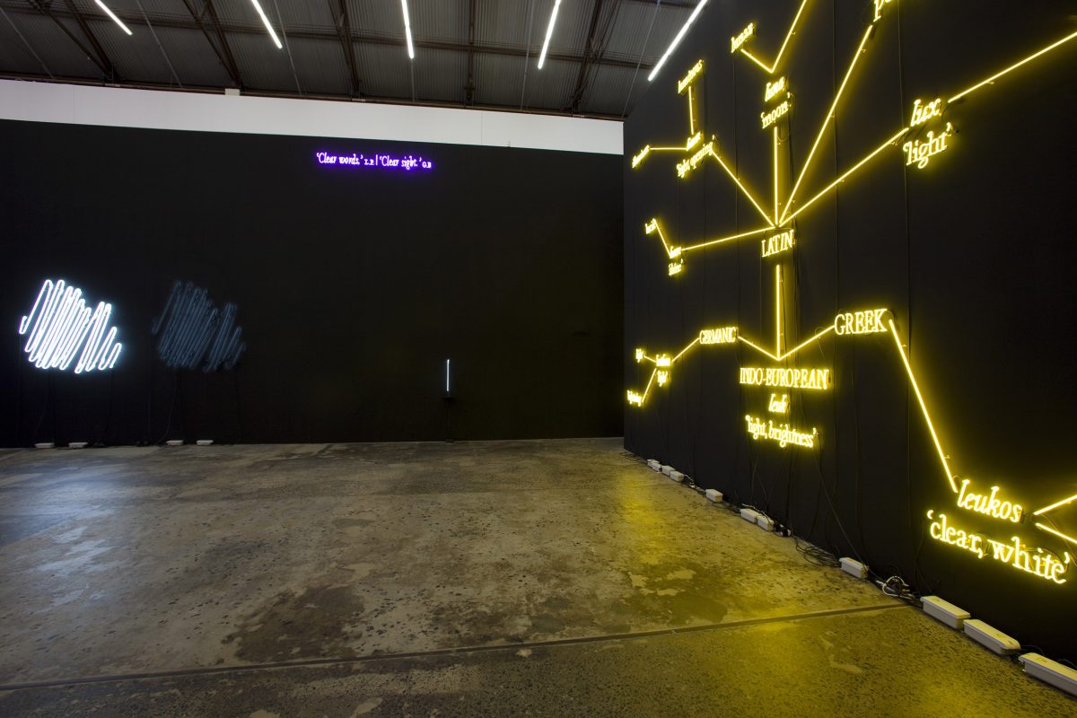
Joseph Kosuth’s contribution to the exhibition begins in 1965 with his first work using the medium.
In 2008, this develops into ‘W.F.T. #1 [yellow]’, born out of Kosuth’s major installation, The Language of Equilibrium, presented on the Island of San Lazzaro degli Armeni during the 2007 Venice Biennale. (‘W.F.T. #1 [yellow]’ premieres here in NEON).
In reference to The Language of Equilibrium, Kosuth states: ‘This project, in yellow neon, has as its basis language itself. It is a work which is a reflection on its own construction… The work engages the cultural and social history of the evolution of language itself, how the history of a word shows its ties to cultures and social realities being quite distinct and disconnected. It is only in the present when a word is used, as it is with a work of art being experienced, that all that which comprises the present finds its location in the process of making meaning. Here, in this work, language becomes both an allegory and an actual result of all of which it should want to speak.’1
Kosuth’s third work, ‘Clear words, Clear sight’, 2007, cites two Italians: Luigi Pirandello and Giordano Bruno. Pirandello – a Nobel Prize winner – is known for his renovation of the drama and the modernist theatre. Concerned with the combination of fiction and reality, and the interpretation of events, for Pirandello, art was the ultimate paradox – where reality is both true and false. Bruno, the philosopher, was a romantic character – without country or religion, having fled his home in search of a place suited to his intellectual integrity. Deeply interested in the nature of ideas, he believed they are only the shadows of truths. He rejected religion and the popular opinions of his day and thus was essentially misunderstood, or, ahead of his time. Kosuth’s ‘Clear words…’ evokes and pays tribute to these two great thinkers. In reducing their oeuvres to two expressions ‘Clear words, Clear sight’ Kosuth distills the complexity and depth of their work and continues his own reflections on language and thought.
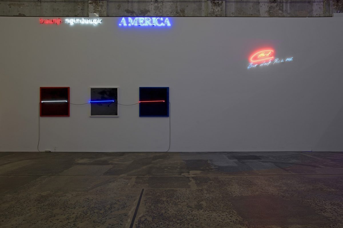
Laurie Anderson’s Neon Bow, 1980, used in her stage performances, evokes the historical beginnings of the use of neon tube in contemporary art. Lucio Fontana’s famous neon arabesque, Struttura al neon (Neon structure) 1951– made in collaboration with the architects Luciano Baldessari and Marcello Grisotti for the IX Milan Triennale and utilising 100 metres of neon tube – is thought to have been influenced by a famous photograph of Pablo Picasso taken by Gjon Mili in 1950, depicting Picasso ‘drawing’ light during the long exposure of the camera. Anderson’s bow invokes this moment.
Janet Burchill and Jennifer McCamley’s Inland Empire, 2008, was conceived during a residency at IASKA, Kellerberrin in Western Australia earlier this year. Originally installed in the desert landscape, the neon tubes were powered by a solar power generator. Installed in this way, beginning in broad daylight, the neon component became clearer as night approached. Inland Empire, like many of the artists’ works, references cinema, in this case David Lynch’s first experiment with digital video. In Lynch’s Inland Empire, 2006, reality and fiction conflate; the female protagonist must overcome adversity within her life and its representation. In a remote town of Western Australia, the artists were engaged by the complexity of racial and gender politics.
‘Hard, but don’t push me’, or, ‘but don’t push me hard’, is both antagonistic and a plea. Indeed, Tracey Emin’s vast body of neon lines skirt the fine border between romance and cynicism, between request and demand, reflecting the very intensity of the artist’s fundamental ambiguity – as both vulnerable woman and aggressive street fighter. The line is often so fine, that the tension is as potent as the striking neon light rendered in Emin’s scratchy handwriting… observing a tradition of fast actions in slow motion – like Lichtenstein’s graphic dot-painted versions of Abstract Expressionist gestures.
Emin’s works call up shared associations, beginning with the very personal. ‘Even when they seem to be addressed to an individual, the words often seem universal – as though they were giving voice to our collective hopes and fears’.2
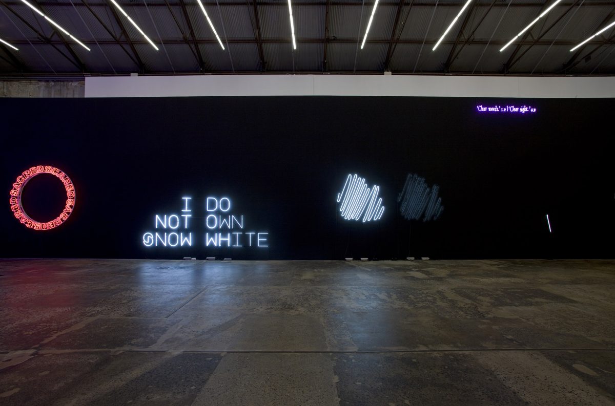
The title of Kendell Geers’ Temene, 2007, comes from the Greek temenos (τεενος), from the verb temno (τενω) ‘to cut’. Technically, the word refers to a kind of geographical isolation, poignant here in Australia, and also selected out from the context of its original body of work. Reading ‘SACRED SCARED’ over and over, the work projects a contemporary condition of displacement.
The structure and typeface are key, as well as the scale, design, shape, and the fact that the wall of the gallery is exposed. ‘Red is said to be the first colour that we perceive and are able to differentiate as babies. Perhaps that is why it is the colour of fear, danger, lust, love, passion and the devil. Of course it is also the colour of blood and red wine – the passion of Christ…’3
Cultural dislocation – or social erasure – is alluded to in Brendan Van Hek’s White out/Black out, 2008. Inspired initially by the idea of ‘whiting out’ text on a typed page, the large polarised scribbles represent white as that which is concealed, and black as void.
Like Emin’s quick text gesture, Van Hek’s work too is connected to the tradition of fast rendered slow, allowing contemplation of the frozen gesture.
Brook Andrew’s work, buunji nginduugir AMERICA, 2001, rendered in red, white and blue – can translate as either ‘share you America’ or ‘bludge you America’, skirting direct lines of meaning. Cultural difference is collapsed into one phrase. The flashing ‘AMERICA’ suggests gaudy Las Vegas motels and is reminiscent of Pop and its icons.
Pop is also invoked, in Andrew’s Warholian screen printed images. The very colours here reflect the text above and the neon’s luminosity is used in Signal II, 2008, to draw attention to the images on the canvas. Archival photographs collected from the Royal Anthropological Institute in London, depict Aborigines performing simulated sex. Used originally as scientific ‘studies’ these images remain unsettling – especially because of the smiling face.
‘The gaze has been really important in my work because it’s not really about confrontation but about the way in which we look at each other and about preconceived ideas. I think that comes from growing up in a mixed family too, because people are always curious. The gaze can be a metaphor for many different things. I’ve made sure the eyes are looking back. They’re almost re-looking.’4
Despite abandoning its original collective of white neon ‘disclaimers’, Pierre Huyghe’s statement I do not own Snow White in NEON is a comment (or disclaimer) of its own material.
Understanding the origin of this seemingly arbitrary reference to a fictional character requires a certain knowledge of the history of the artist’s practice. Without this context, however, the work still expresses a very bold and confident statement, in its large white font. Questions of the ownership of ideas and copyright are always present, but the statement also leaves viewers in an imagined space. What does Huyghe have to do with Snow White? In the context of the exhibition Celebration Park – from which this piece is derived – there would be additional statements, such as I do not own Tate Modern, I do not own 4’33”, collectively referred to as ‘disclaimers’. Going back further in the artist’s practice, we encounter Blanche Neige Lucie, 1997. The work depicts a woman singing ‘Someday my prince will come’, while a story appears in subtitles on the video. The woman, Lucie Dolène, was used by Disney to dub Snow White in French. When a court case was announced by her against Disney, Huyghe conceived the work, which like his other works, plays with the confusion of fiction with reality – consistently skirting both.
Lori Hersberger also investigates fictive space, though through a more formal art/painting strategy. Hersberger’s giant empty frames in Ghost Rider (Doors) evoke minimalist paintings, or, non-paintings. The picture plane becomes the frame, and the void an imagined space. Ghost Rideris an ongoing project for Hersberger – the works always resulting in empty rectangles/squares, with carefully selected colours. In Ghost Rider (Doors) the ‘violet (or dark purple) represents mystery, secret, the occult, the strange (the exotic), the shades between red and blue – it stands for solitude and creativity, unsatisfied and aphrodisiac. It is believed violet is the colour of penance and contemplation’.5
In addition to the neon presented on the wall, Hersberger’s installation extends onto – and through – the floor. Just as the audience is invited to immerse and complete the picture within the neon frames, the reflective surface of the black glass, or mirror, completes the picture and extends the work through the floor of the gallery. The work is composed differently depending on the vantage point of the viewer.
Within Hersberger’s mirror, we experience the exhibition anew.
Tania Doropoulos, Curator, 2008
Notes 1 Kosuth quoted in the press release for the project. http://www.fluxumfoundation.co… 2 Sarah Kent, “Tracey Emin: Flying High”, http://www.whitecube.com/artists/emin/texts/88. First published in Neal Brown, Sarah Kent and Matthew Collings, Tracey Emin, London: Jay Jopling/White Cube, 1998. 3 Email correspondence with the artist, August 2008. 4 Brook Andrew in an interview with Hetti Perkins in, Hetti Perkins and Jonathan Jones (eds), Half light: portraits from Black Australia, exhibition catalogue, Art Gallery of New South Wales, Sydney, 2008. 5 Email correspondence with the artist, August 2008.
Images

NEON, 2008
installation view, Anna Schwartz Gallery, Carriageworks
Photo: Paul Green
Curated by Tania Doropoulos
NEON, 2008
installation view, Anna Schwartz Gallery, Carriageworks
Photo: Paul Green
Curated by Tania Doropoulos
NEON, 2008
installation view, Anna Schwartz Gallery, Carriageworks
Photo: Paul Green
Curated by Tania Doropoulos
NEON, 2008
installation view, Anna Schwartz Gallery, Carriageworks
Photo: Paul Green
Curated by Tania Doropoulos