Kate Mitchell, Sanné Mestrom, Laresa Kosloff, Lauren Brincat, Agatha Gothe-Snape, Joshua Petherick, Stuart Ringholt
Social Sculpture
2nd April – 18th June 2011
Anna Schwartz Gallery Carriageworks
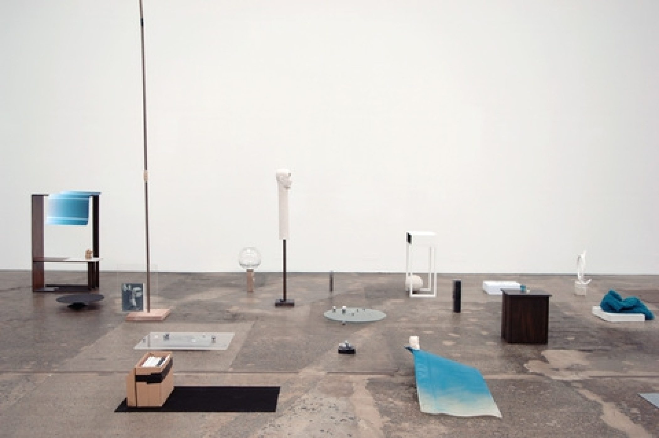
Turning the gallery inside out was the starting point for Social Sculpture, to open up the gallery to a range of temporal and process-oriented practices. This emptying out provided the opportunity to think about the gallery’s physical space in particular ways. It allowed a consideration of its literal and metaphorical weight, how artworks are situated within it, the space between the works and the pedestals and supports for works, and the way in which artists and visitors inhabit and interact in such spaces.
Social sculpture is a loaded term with its historical connection to the work of the German conceptual artist Joseph Beuys. He wanted to describe the expansion of art beyond previously existing definitions and its capacity as an agent of change in the world. In the contemporary context, Social sculpture is less politically idealistic but the term remains, importantly, an heroic endeavour. Social sculpture relates the expanded field of sculpture – here incorporating installation, video, and actions – to people, and people to sculpture. It is about the embodied art experience – both the artist/performer’s and the viewer’s.
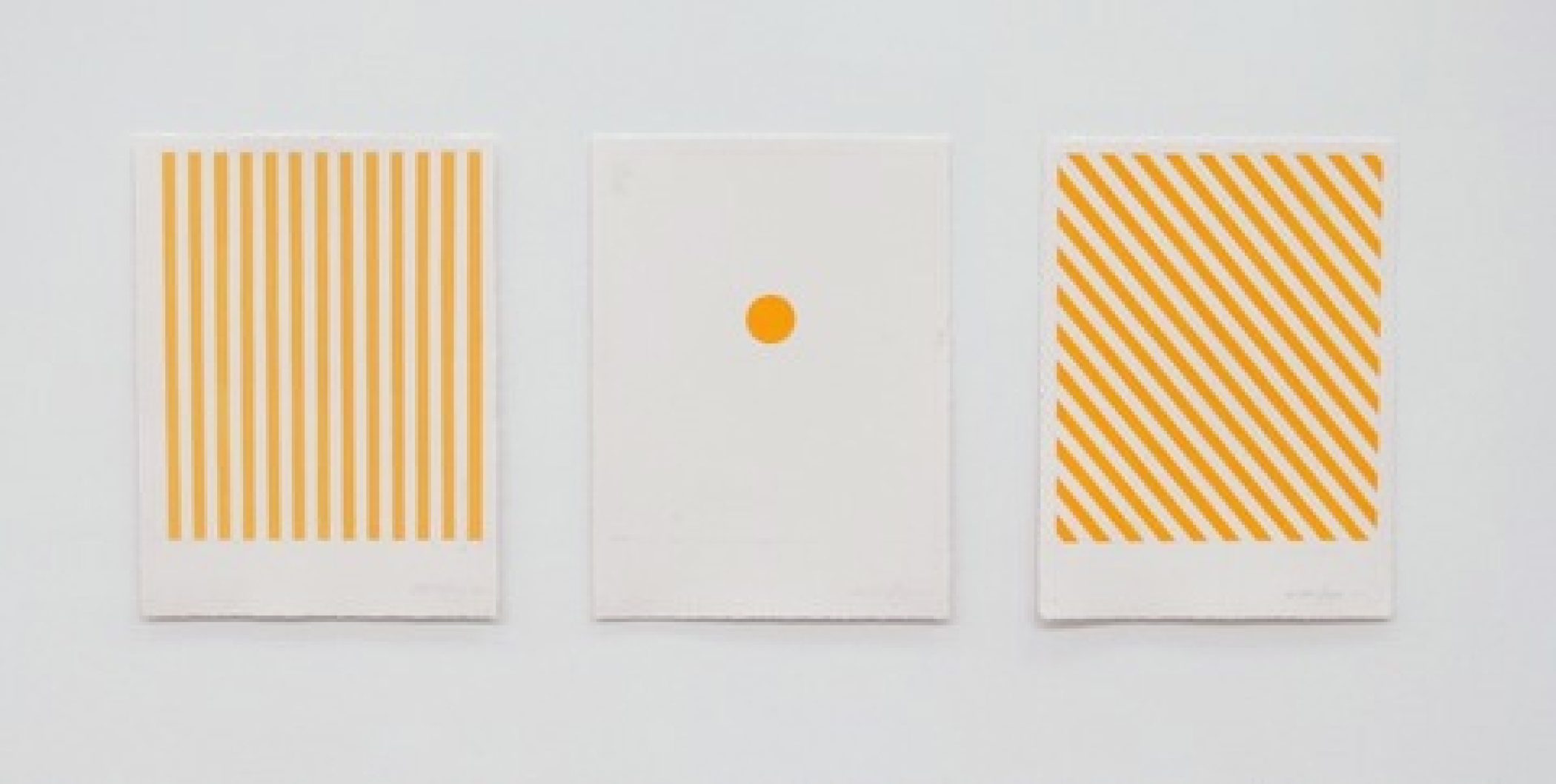
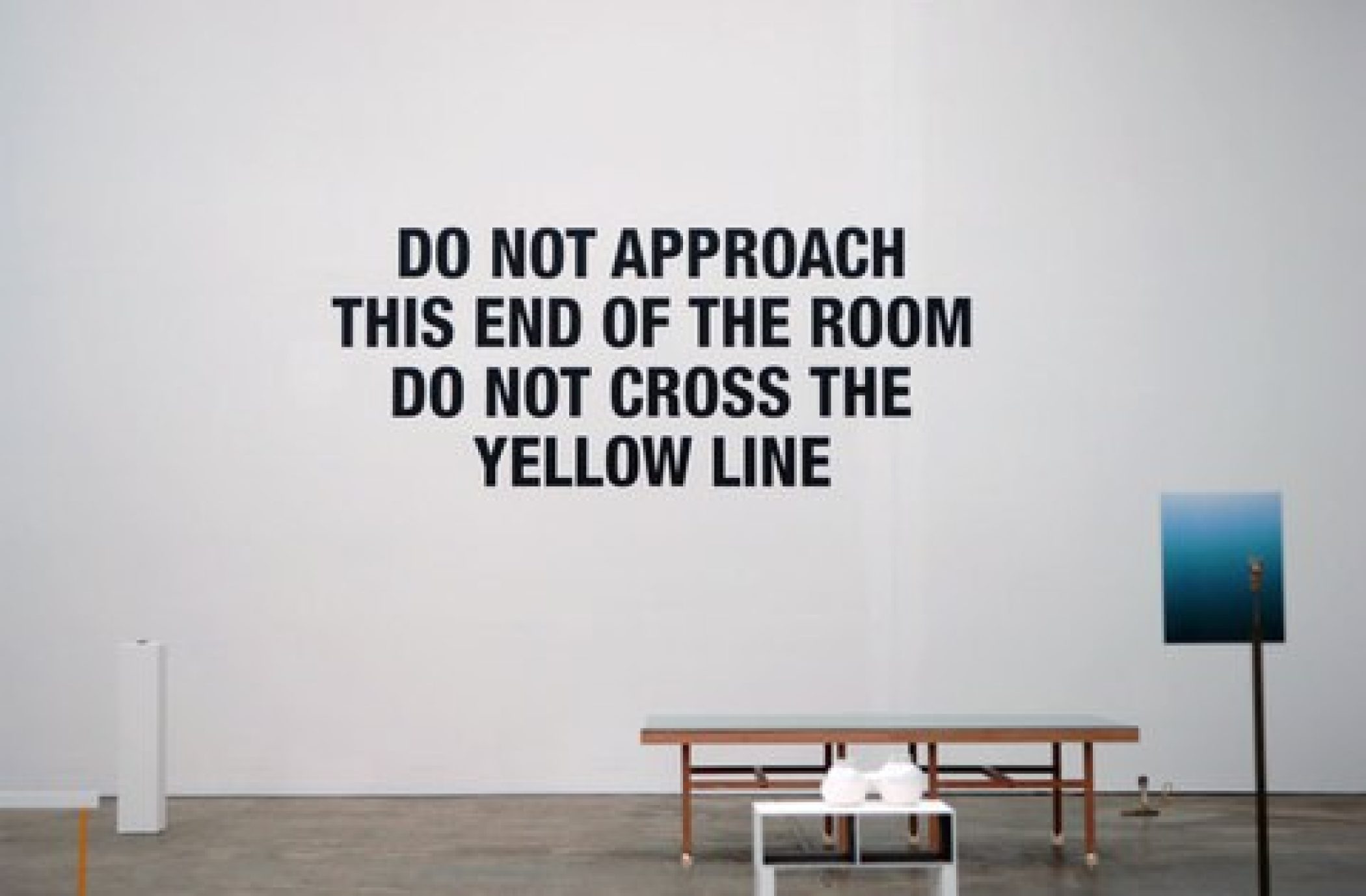
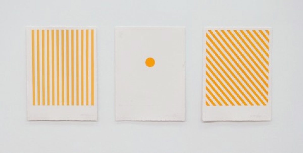
AGATHA GOTHE-SNAPE’S instruction written in large Helvetica letters on the gallery’s far wall reads: DO NOT APPROACH THIS END OF THE ROOM DO NOT CROSS THE YELLOW LINE. Immediately we are alerted to the conventions governing viewers’ behaviour and the demarcation of works of art within the gallery space. We become conscious of how we move, often tentatively, around and between artworks. This is a reminder too, of the most palpable of commands in the gallery: DO NOT TOUCH THE ART WORK. Gothe-Snape’s single line lifted from the page and running along the gallery floor dramatically divides the space, although for no apparent reason other than the willfulness of the artist. Yet there may be something more to it. This dramatic yellow line is a warning and a threshold, a test of the viewer’s obedience or disobedience. The viewer is faced with a dilemma and is likely to transgress the artist’s instruction providing a moment of potential liberation from more passive engagement. In accompanying gouache drawings, she plots other possible delineations and ways of moving through the space. This conception of the gallery as platform or arena, with the activity of people centre stage, their bodies becoming the sculpture, is intrinsic to Gothe-Snape’s practice.
Invisible forces are the focus of SANNÉ MESTROM sculptural installations – in this instance, the bare weight of the gallery space. Mestrom’s group of sculptures, made from found, constructed and cast elements, each weighs 6.5 kilograms, and is equivalent to the weight of air in the space it occupies in the gallery. Although the individual assemblages are therefore related in this fundamental way, they vary substantially in scale and substance. Mestrom draws attention to the inherent properties of materials (such as bronze, marble and wool) as well as to the processes of fabrication that bring an object into being; she mixes up original with casts and copies, and solid and transparent forms with those veneered. There is a playfulness at work in the activity of measuring up. To achieve the correct weight, a portion of a face is removed from a mannequin, small counterweights of copper and lead are added to another, and drawers are removed from furniture. In Compression Chamber (2011), the immaterial cultural and philosophical weightiness of objects and an understanding of the specificity of their context, is also made manifest: an archive box of PhD research files reminds us of the embedded research; a warm jumper is wrapped protectively around a garden-variety gargoyle, usually exposed to the elements; and preciousness is reinstated by casting in bronze a $2 shop Buddha.
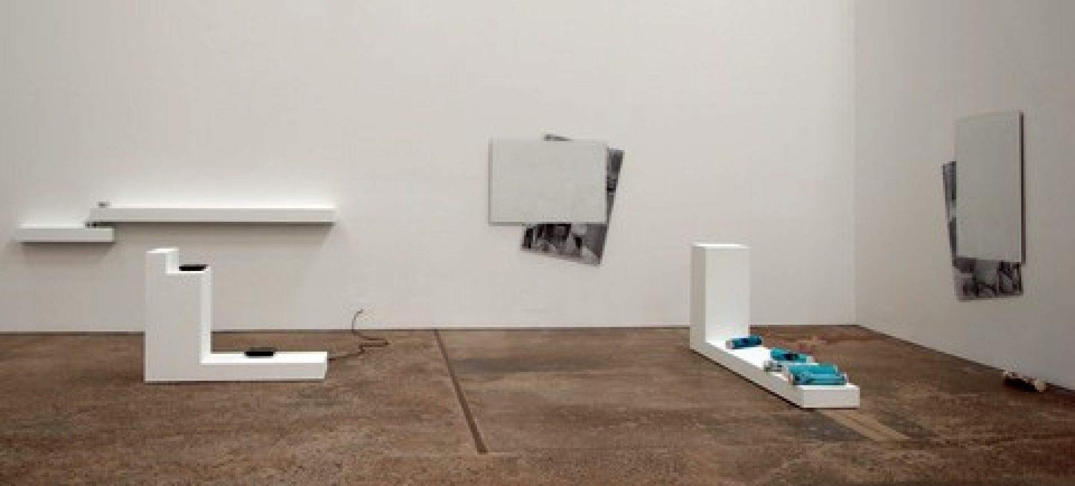
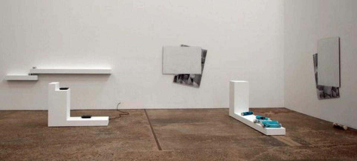
JOSHUA PETHERICK adopts a circular system of manual and mechanical reproduction that folds back on itself. He pushes processes of scanning and copying, and reduction and enlargement well past any logical resolution ‘to bring them to a solitudinous state’. Both Petherick and Mestrom relate their works to ‘compression’ and to the intangible energy found in a material that enables it to be continuously transformed. This is evident in Petherick’s interest in the ghosting of past images fixed to exhausted copying drums and in the profiles left in the off cuts of collages. The idea of the bootleg is relevant to his tapping into the subversive or un-authorised potential of materials, through various kinds of copying, translation and re-working. His floor and wall pieces in Social Sculpture function both as artworks and display units, collapsing two-dimensional pictorial space and the three dimensions of sculpture into each other through a process of blowing up and making solid sheets and off cuts of A4 paper. Conventions of display appear to give way to more fluid relationships between forms, processes and structures of support, resisting notions of completeness in preference to openness to variation and chance association.
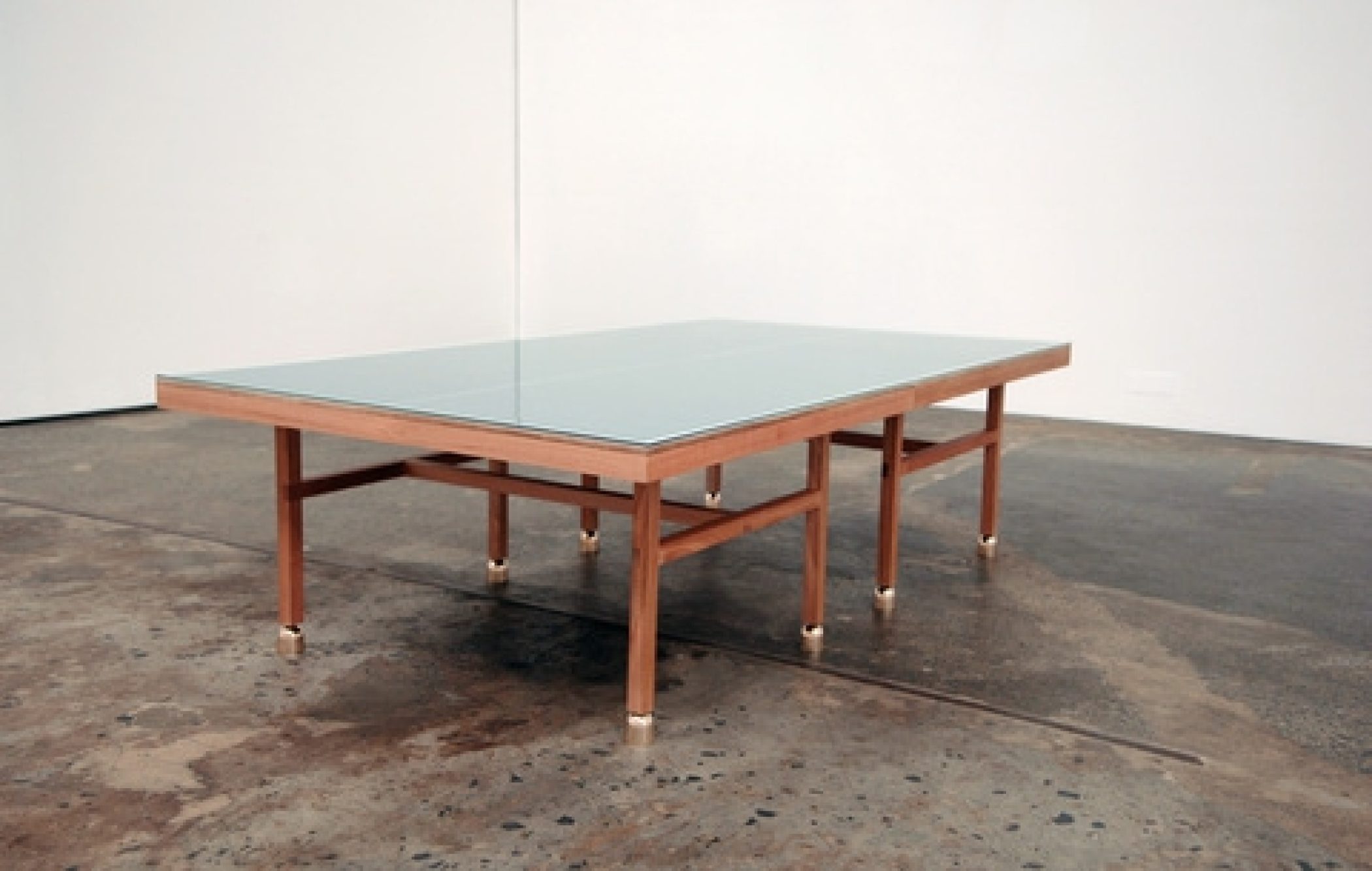
LAUREN BRINCAT’S suite of works is a convergence of figurative and abstract elements that confound easy classification or explanation. Her family’s formal dining table – the one that sat unused, albeit for its capacity to symbolise domestic order and gentility, is the model for the Good Table (2011). This work combines the idea of ornate decorative furniture with the table-tennis table, which was in fact used for family occasions. The new table-tennis table is dressed up ‘with bells on’ in the spirit of its historical re-purposing. Abstracted from its usual function, an appraisal of the table-tennis table’s formal properties is encouraged – the particular shade of green, the lines and proportions, and its relationship to the body and how the game is played. It’s not much of a stretch of the imagination to envisage the table as an abstract painting that has been taken off the wall and rested on bell-bottomed legs. As a “painter who doesn’t paint”, Brincat is drawn to such meddling and surreal de-stabilising. Nearby, a taxidermy cobra, stick and rope floor-based ensemble surrounded by ‘hazard signs’ is a ‘viewing trap’ or ruse that further disrupts the contemplation of her shifting furniture/sculpture/painting.
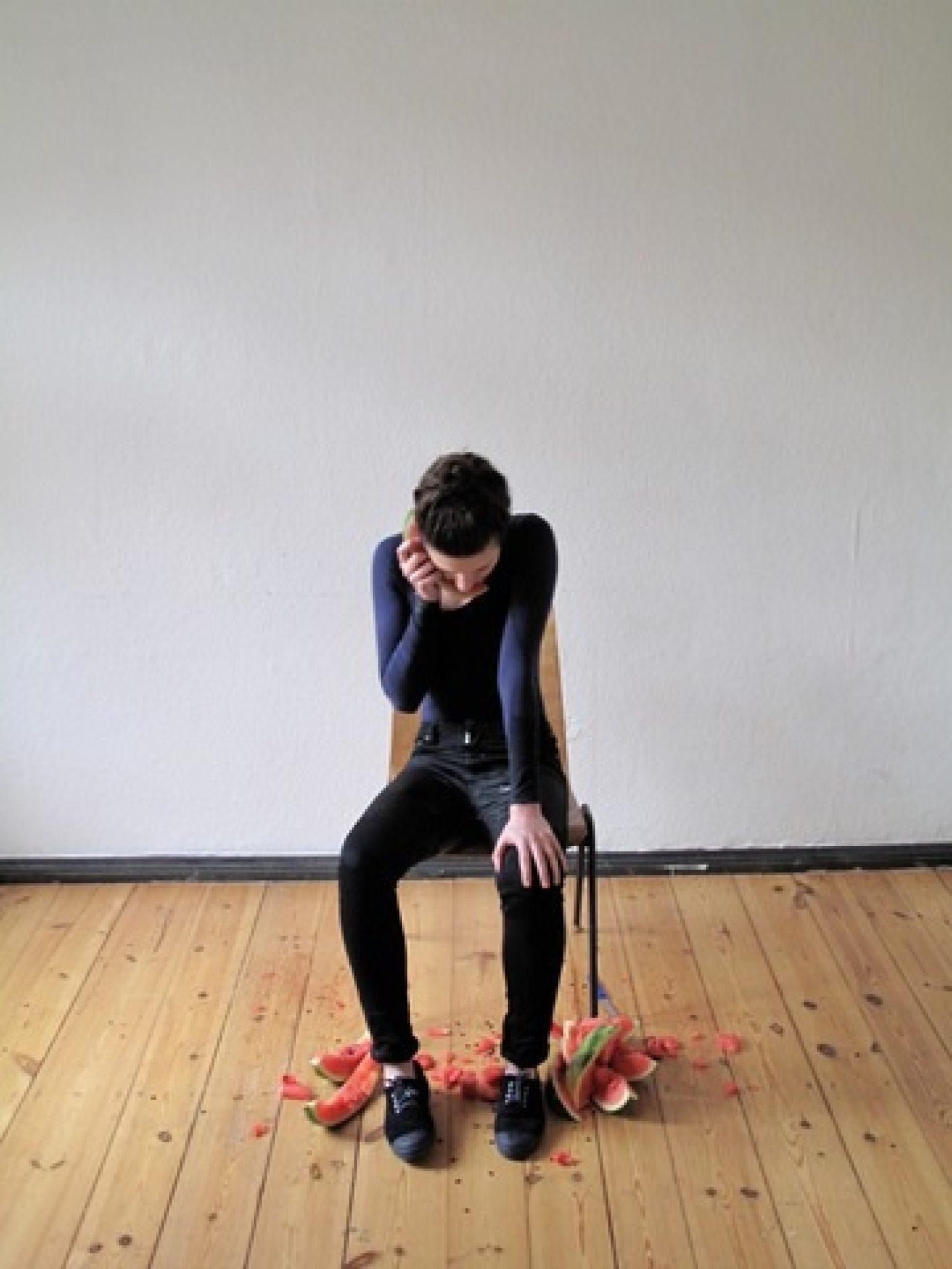
Brincat’s attraction to the associate powers of colours and forms is reiterated in Hear This (2011), which records an extended phone conversation via wedges of watermelon. In the tradition of endurance and durational performance works, Brincat appears to listen to the watermelon wedges, the bright pink pulp soaking her face and body, in a way that’s both absurd and melancholic, as we imagine an emotional exchange with the artist left eating her own words.
STUART RINGHOLT’S Untitled (wing chair – pink) (2009) is a chair made from a section of an old enamel bath-tub elevated like a museum piece on a plywood plinth. Whereas Brincat’s table is made impractical, we can well imagine reclining in Ringholt’s chair. As in many of Ringholt’s works, potential usefulness is an important criterion. The chair is reminiscent of classic modern designs, form and function happily coalescing for streamlined and well-organised living but this chair is made from cast-off bathroom fixtures, the unfinished underside of the bath revealed for the first time. And rather than being of the latest designer material, the surface is old enamel, evoking a range of therapeutic yet slightly unpleasant associations when we think about the bodies that may have inhabited the tub. That’s the point: this is not an ideal chair but one that is intrinsically linked to the body.
Ringholt’s objects can be considered as cultural artifacts of our time. His innovative 19-hour men’s wristwatch is the perfect accessory for the occupier of the chair – the compulsively busy, stressed out and weary 21st century body. The watch stretches time, promising more hours in the day. Isn’t that what we most wish for – to have more time up our sleeve? But what are the implications of additional time? Based on current trends, it is likely we wouldn’t take advantage of this to meet our existing obligations, but rather use the time to do even more.
For KATE MITCHELL, the idea of art as work and the artist as both manager and worker is fundamental. In a series of video re-enactments of classic comic situations she has been making since 2006, Mitchell dons standard work clothes and boots (much like Beuys) to perform planned actions that often involve a degree of precariousness, risk and danger. In A Situation (2011) shows her poised on a plank protruding from a dairy shed in an idyllic country setting. Mitchell proceeds to saw through the plank and after a protracted period of time, but actually only a six-minute single-take, the anticipated and unavoidable happens. As she falls to the ground, she rolls over, gets up and calmly walks away. The work is funny but unsettling, in the manner of Funniest Home Videos. We laugh guiltily.
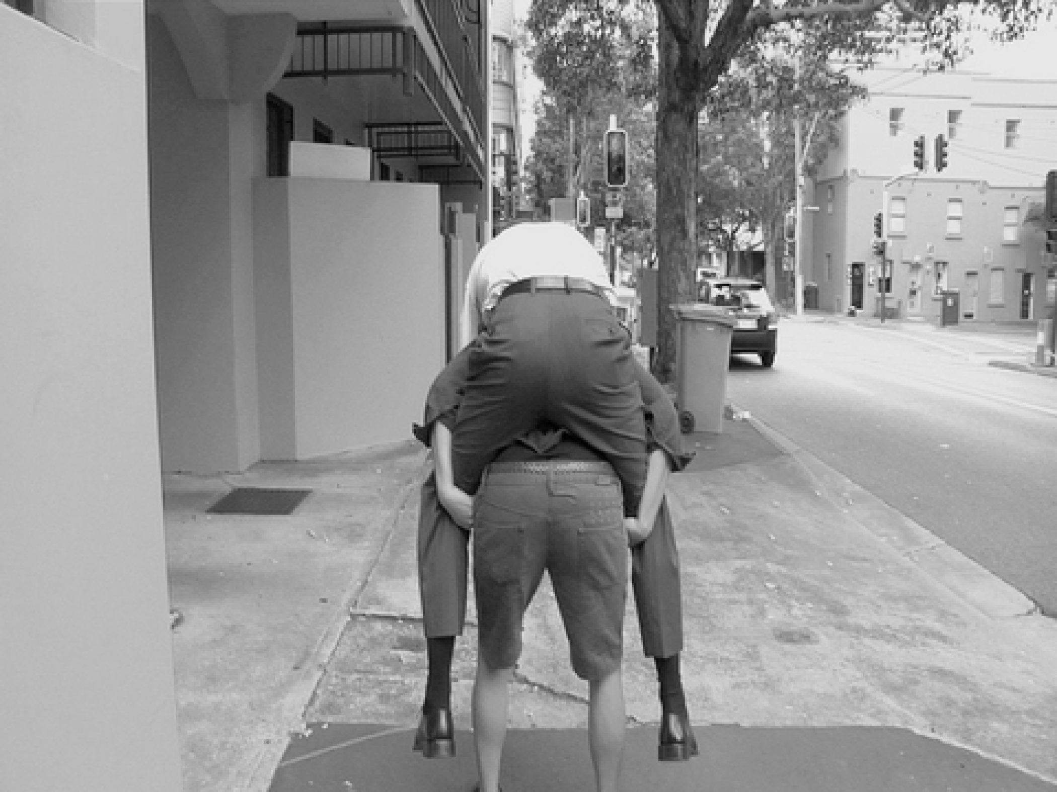
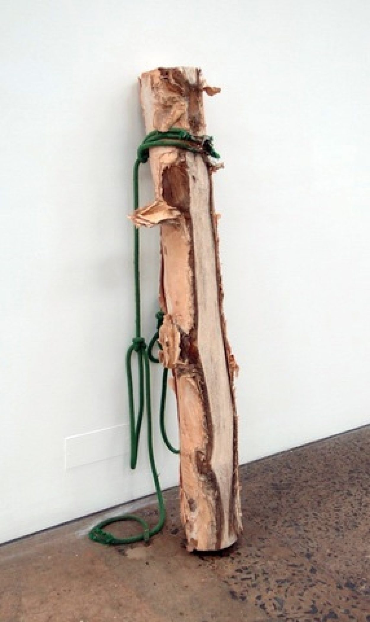
In Lost A Bet (2011) Mitchell offers to piggyback a businessman from his home to his office in her bid to provide a tangible service. The more awkward and difficult the task becomes the more aware we are of her commitment to the action and her unfailing work ethic. One of her most significant endurance works, she describes it as a covert justification for conceptual art: ‘Hey, I lost the Bet!’. This is an understatement that nonetheless is consistent with the humorous and often self-effacing nature of Mitchell’s work, but the effort to prove herself brave, strong, capable and hard working is genuine. Every new work is an additional test of her abilities and attempt to legitimise her art work, nowhere more evident than in the heavy log Mitchell has dragged across Sydney and left as a calling card in the gallery, its underside worn away by the impact of the extraordinary journey.
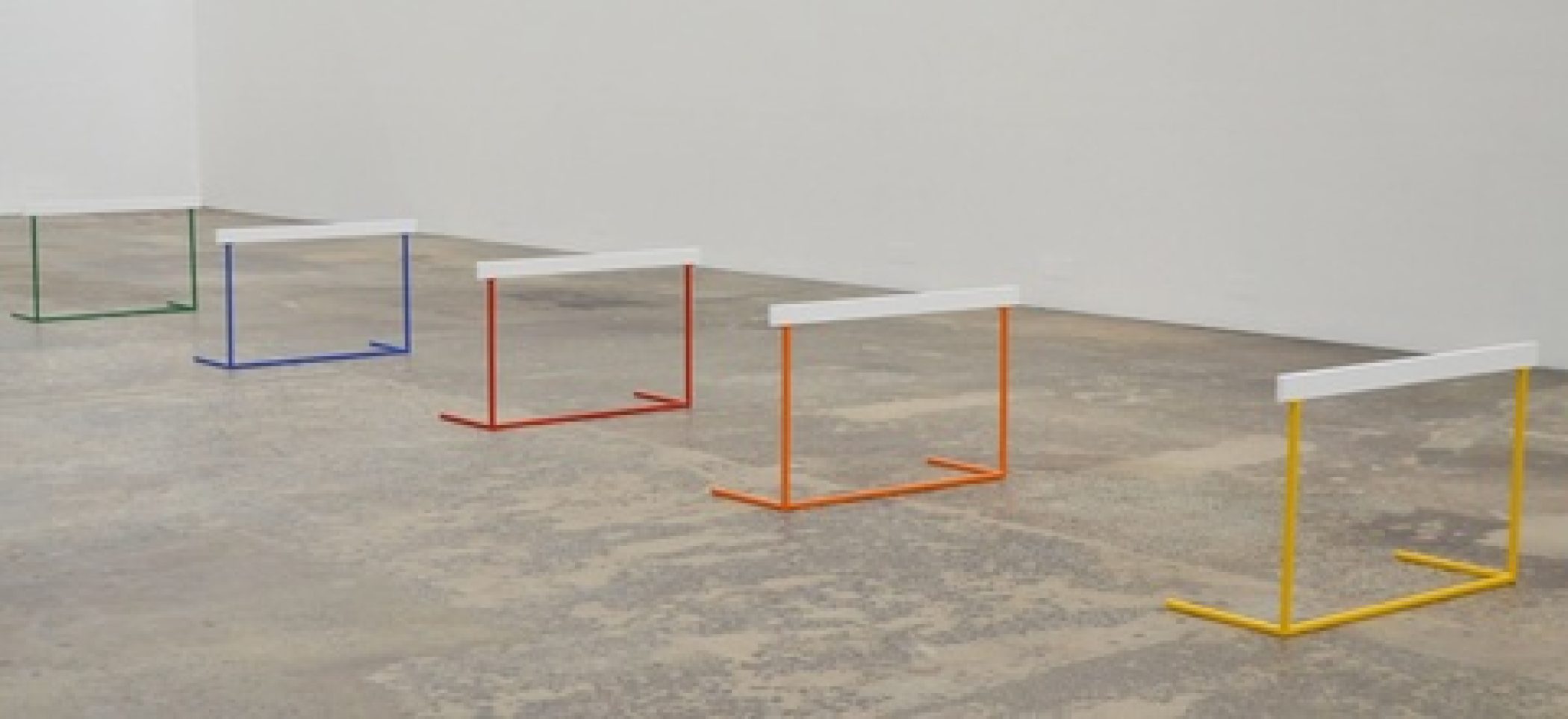
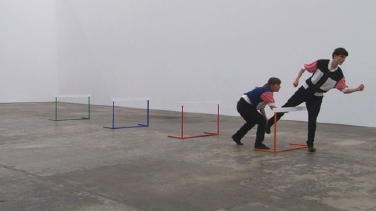
LARESA KOSLOFF’S videos record staged actions using amateur performers. They share a particular quality of being out of synch in some way, appearing to be abstracted from real time or routine practices to focus more intently on embodied experiences, often with a comical dimension. In Agility drill (2011) Kosloff brings the performance into the gallery, setting up a series of coloured steel props, which look very like hurdles, at regular intervals down the length of the space. The performance involves Kosloff training someone via a protracted and clumsy process of learning through movement. In matching ‘sports’ outfits that create a doubling of sorts, Kosloff manually moves each of the arms and legs of the performer over the hurdles in a sequence reminiscent of a Buster Keaton sketch. The hurdles remain for the duration of the exhibition, a trace of the activation of the sculpture, while video footage of the performance is reintroduced as a screen-based element. Echoing the early stop-frame photographic sequences of Eadweard Muybridge, Kosloff again fractures movement; she makes us more conscious of the human form in relation to the spaces we inhabit, the way our minds and bodies are required to work in unison, to analyse human interconnectedness and fallibility.
Charlotte Day, 2011
Images
Social Sculpture, 2011
installation view, Anna Schwartz Gallery, Carriageworks
Curated by Charlotte Day
Social Sculpture, 2011
installation view, Anna Schwartz Gallery, Carriageworks
Curated by Charlotte Day
Social Sculpture, 2011
installation view, Anna Schwartz Gallery, Carriageworks
Curated by Charlotte Day
Agatha Gothe-Snape
Choreography #2, #24, #6, 2011
Gouache on Arches paper
76 x 56 cm (each)

Agatha Gothe-Snape
Text Work, 2011
Vinyl letters
Dimensions variable
Joshua Petherick
Simultaneous Solitudes, 2011
Mixed media
Dimensions variable
Laresa Kosloff
Agility Drill, 2011
Single-channel High Definition digital video, 16:9, colour, sound
5 minutes 45 seconds
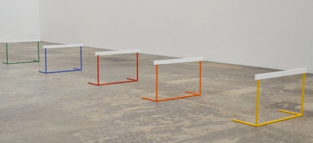
Laresa Kosloff
Race Shape, 2011
Powder coated steel, wood, acrylic paint
Five parts, 60 x 100 x 40 cm (each)

Kate Mitchell
Lost a Bet, 2011
Single-channel SD video, black and white, sound, 9″ flat screen, framed newspaper advertisement
19 minutes 38 seconds

Kate Mitchell
A Log Dragged From Its Origin to Here, 2011
Paperbark log, rope, nails
147 cm x 8.5 cm (radius)
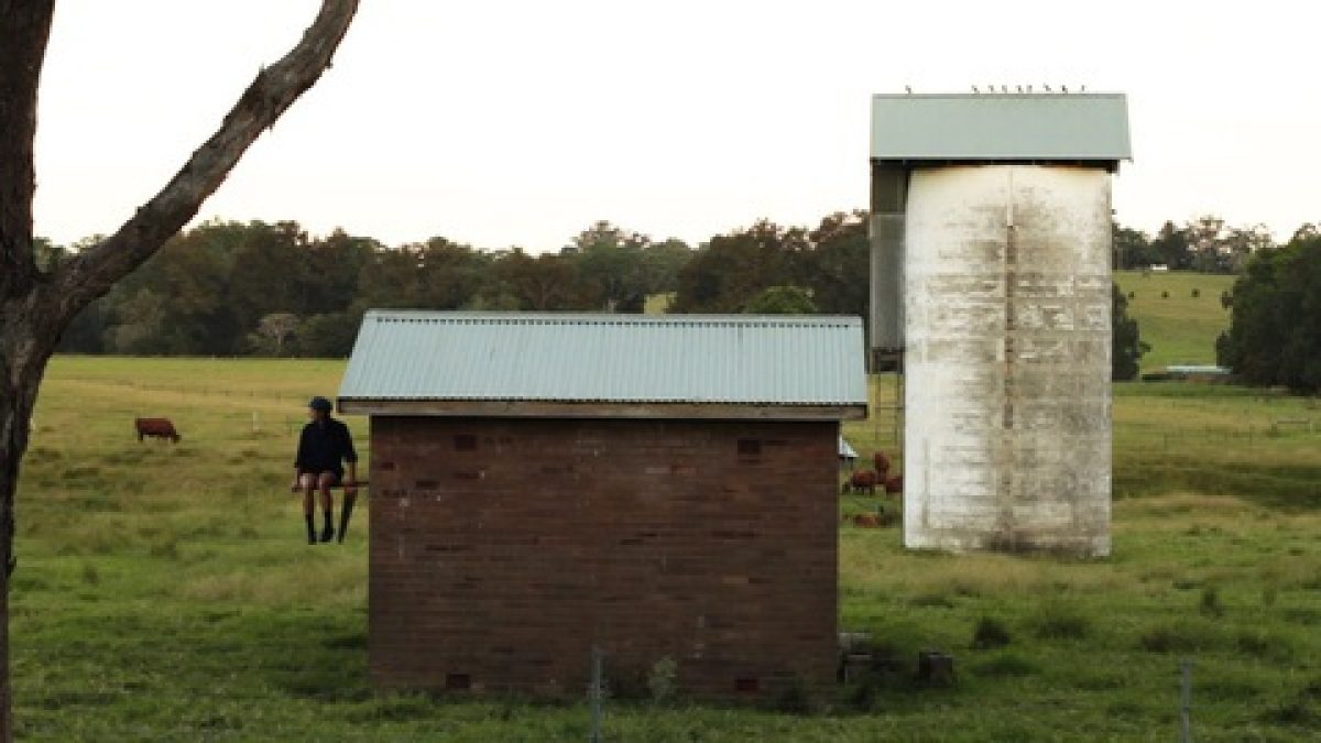
Kate Mitchell
In a Situation, 2011
Single-channel High Definition digital video, 16:9, colour, silent
6 minutes 2 minutes
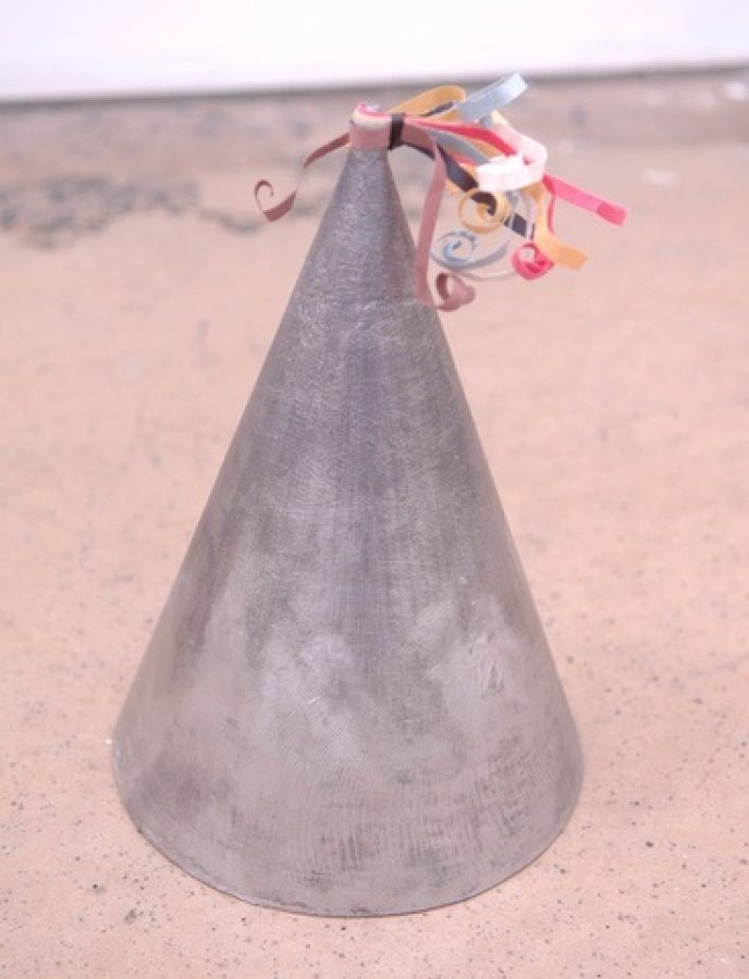
Kate Mitchell
29kg Party Hat, 2011
Lead, archival quality watercolour paper
26 x 9 cm (radius)
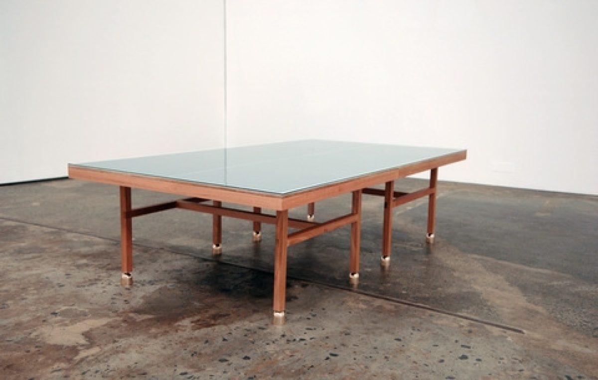
Lauren Brincat
Good Table, 2011
Handcast brass bells, timber, glass, acrylic
70 x 270 x 150 cm
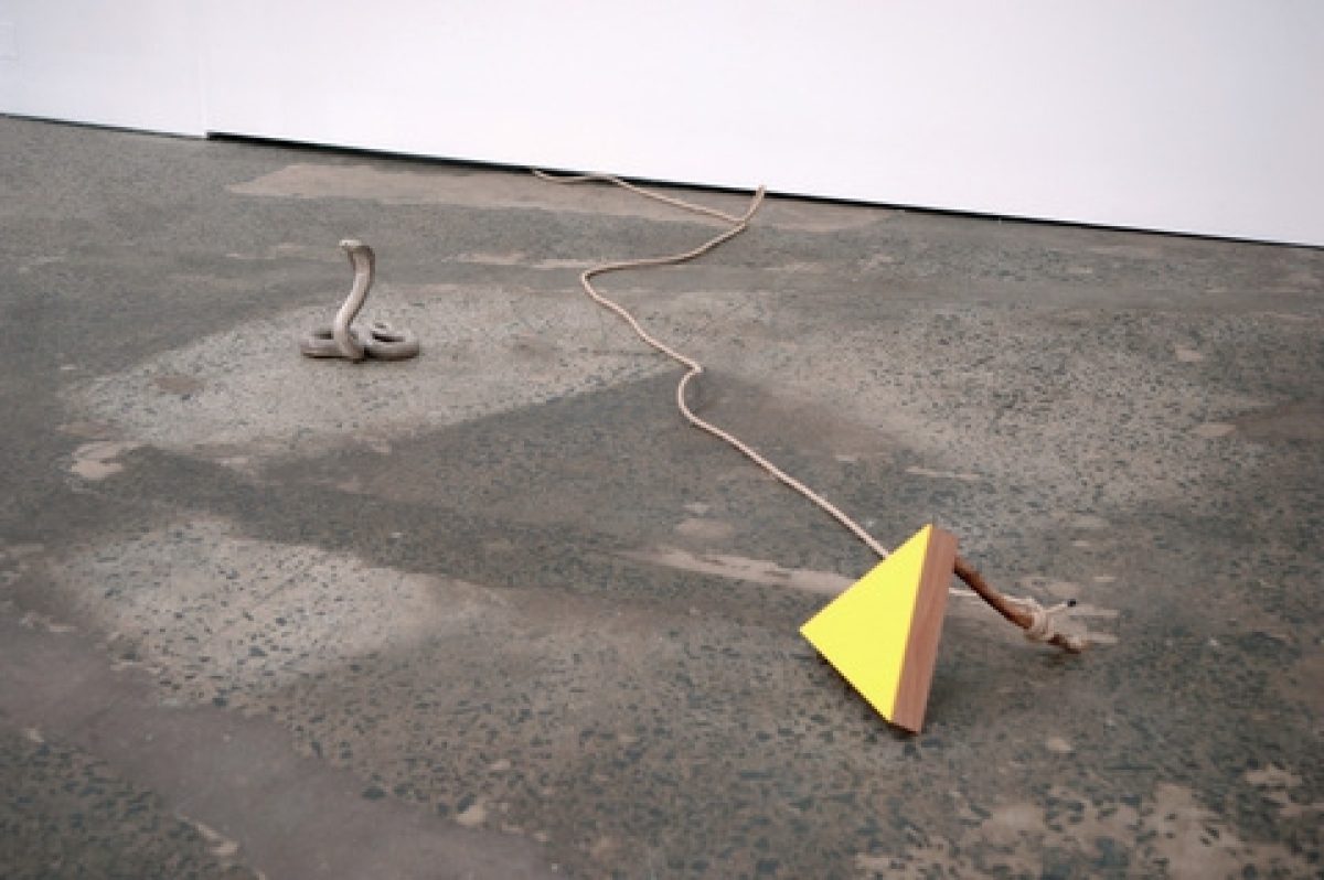
Lauren Brincat
The Quick and the Dead, 2011
Taxidermy cobra, timber, acrylic, rope
Dimensions variable

Lauren Brincat
Hear This, 2011
Video documentation of an action
8 minutes 5 seconds
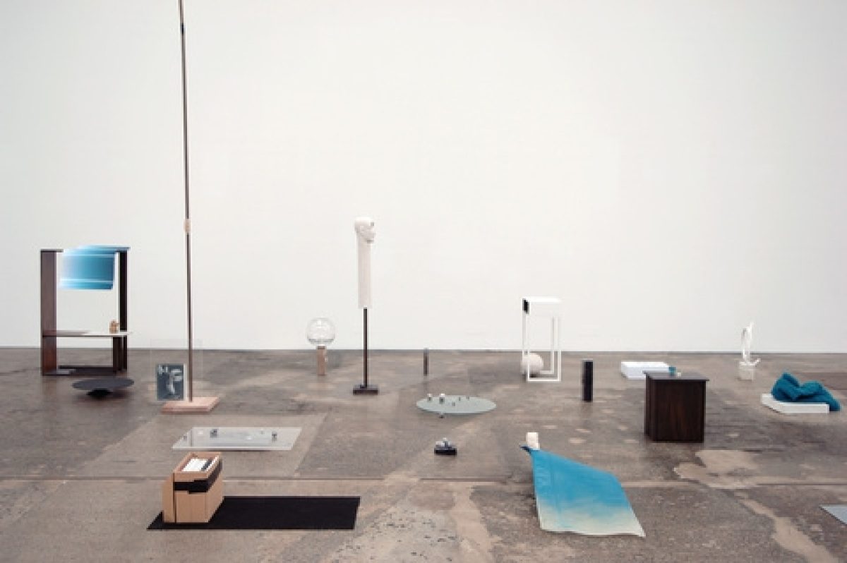
Sanné Mestrom
Compression Chamber, 2011
Mixed media
Dimensions variable
